


This website uses cookies to improve your experience. We'll assume you're ok with this, but you can opt-out if you wish. Read More
SECTIONS
INTRODUCTION
JADBio is a platform designed specifically to extract value and insight from multi-omics data sets, typically thousands of measurements in a small number of samples. JADBio’s uniquely tuned Automated Machine Learning (AutoML) is guided by Artificial Intelligence (AI) to provide accurate and efficient predictive models for Classification, Regression and Survival (Time to Event) analysis.
JADBio is very straightforward to use:
- Upload your data
- Transform your data (optional)
- Analyze your data
- View your results (optional)
- Share your results
- Test your data (optional)
ACCESSING JADBio
In your browser of choice, navigate to JADBIO.com
Click on the LOG IN button in the top right corner if you already have an account or the 14-DAY TRIAL button if you don’t, to sign up and get a free trial account.
Try for free (Sign up)
Complete the Registration form.
Click on SIGN UP
After you register, you will receive an e-mail from no-reply@jadbio.com with the subject line, JADBio Email Verification.
To verify your email and activate your account, please open the e-mail, and click on the provided link.
Log In (Sign in)
Type in your username and password and click on the SIGN IN button.
Note: During this How-To Guide we will be using a specific dataset, the Potatoes_quality dataset in order to showcase the platforms capabilities. You will find it on the platform, available for uploading in your project, along with other JAD use cases datasets. We strongly suggest you upload it in order to follow the tutorial. Obviously the guidelines apply to all datasets but it will make understanding the platform easier, if you follow along.

VIEWING DATA & ANALYSES on JADBio
JADBio HEADER
The JADBio header contains:
- Notifications under the bell icon on the right.
- Logout function under your username.
MENU
The MENU sidebar provides navigation to the Dashboard, to your Projects, to your Datasets and to your Collaborators, as well as to the USER Settings.
DASHBOARD
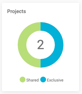
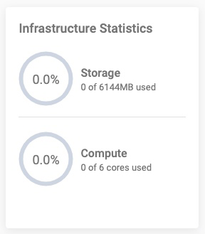
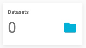
The Dashboard provides an overview of your Account. This includes:
- Projects: A graphic representation of shared and exclusive projects. To start, you will have one shared project.
- Infrastructure Statistics: A summary of your current Storage and Compute. Standard subscriptions include 2 or 6 cores.
- Datasets: The total number of your Datasets.
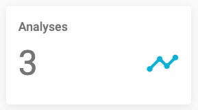
- Analyses: The total number of Analyses.
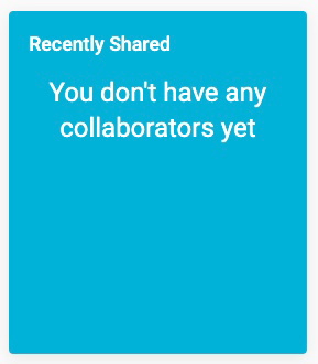
- Recently Shared: A list of your current Collaborators. When you share a project with another subscriber, they become a collaborator, and your project is defined as shared.
- Active Subscription: Your Subscription Plan and its expiration date.
- Collaborators: The total number of your Collaborators, other subscribers with whom you have shared projects.
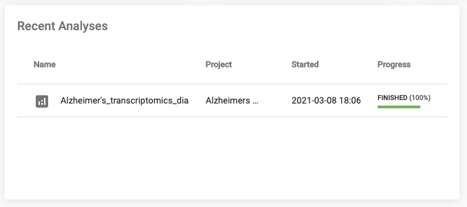
- Recent Analyses: A list of all currently running Analyses.
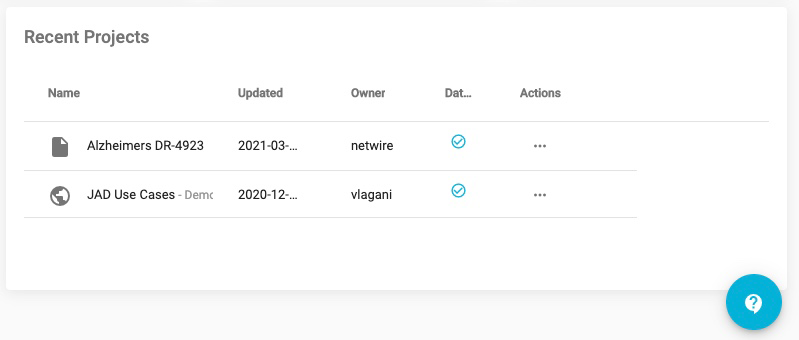
- Recent Projects: A list with links to your current Project.
- Also, there is a +CREATE PROJECT button in the top right of your dashboard that allows you to create a project and a LIST PROJECTS button that opens your Projects window.


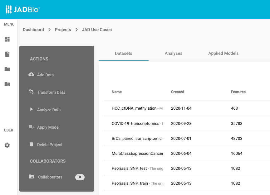
PROJECTS
Click on the LIST PROJECTS button.
Note: The Projects includes a shared project, JAD Use Cases, which includes several datasets in order for you to have some examples to work with in JADBio. You cannot change the data in this public project, but, as you can see later, you will be able to import this data into another project.
Each project is described by the following characteristics:
- An icon that describes the number of collaborators and sharing status. The JAD Use Cases, has a global icon, because this data is shared publicly.
- The name of the project, and a short description, both of which can be used as values for a project search in the Filter tool at the top of the Projects window.
- The date the project was Created.
- The initial creator of the Project.
- A flag to indicate the presence of a dataset.
- Actions that will allow you to view or remove the project.

JAD Use Cases (SAMPLE DATA)
Under Actions, click on the View project icon
Within the JAD Use Cases project you will have several layers of information:
- Below the JADBio header, you will now see that you are in Dashboard > Projects > JAD Use Cases
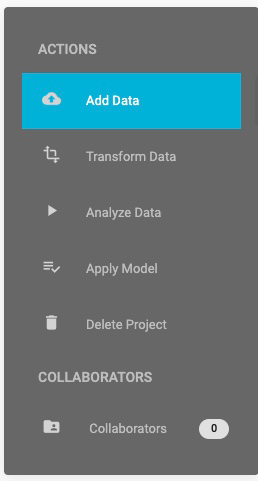
- In the top left, in the ACTIONS sidebar, you will have five buttons that will allow you to perform a variety of functions with the project:
- Add Data
- Transform Data
- Analyze Data
- Apply Model
- Delete Project
- In the same sidebar, JADBio provides the option to view/add collaborators to your Project.
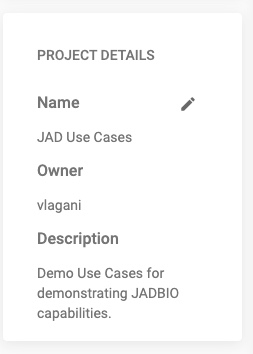
- In the PROJECT DETAILS sidebar, JADBio provides information about your Project: Name, Owner, and a short Description of your Project, if one was created.
- JADBio provides navigation to three different views of your Project window: Datasets, Analyses, and Applied Models.
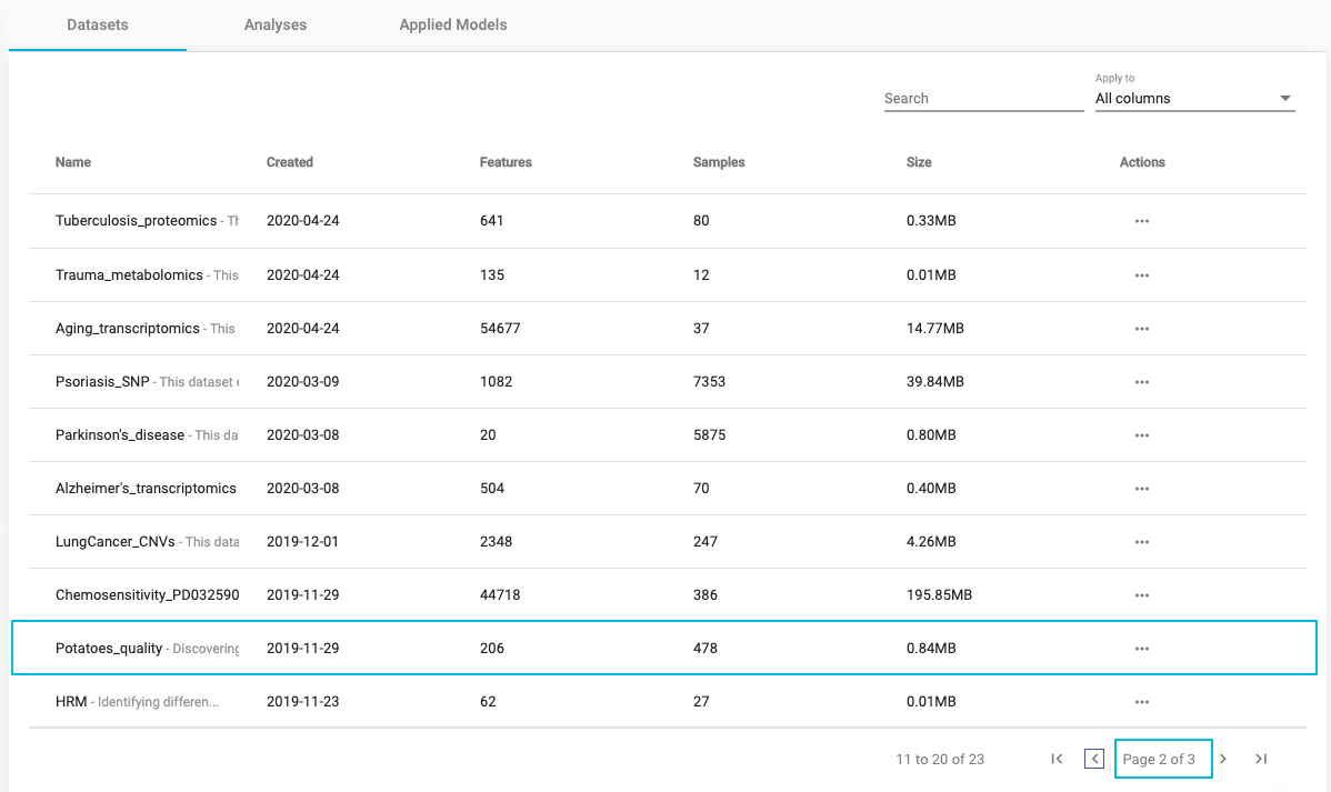
DATASETS
Click on the Datasets label, to view the available datasets in the JADBio Use Cases project.
Datasets includes a description of all of the datasets in a tabular format:
- Name
- Created
- Features
- Samples
- Size
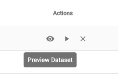
- Under the Actions column, JADBio provides buttons to:
- Preview Dataset
- Perform Analysis
- Detach Dataset
SAMPLE DATASET: POTATOES QUALITY
Find the Potatoes_quality dataset. You might have to go to the 2nd or 3rd page.
Click on the three dots, to open the Actions menu associated with the Potatoes_quality dataset.
Select the Preview dataset icon.
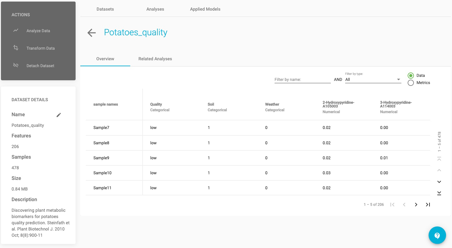
In Preview dataset:
- ACTIONS sidebar, provides 3 possible actions to perform with the dataset: to Analyze Data, to Transform Data or to Detach Dataset.
- DATASET DETAILS sidebar, includes: Name, number of Features, number of Samples, file Size and a short Description of the dataset, if one was created.
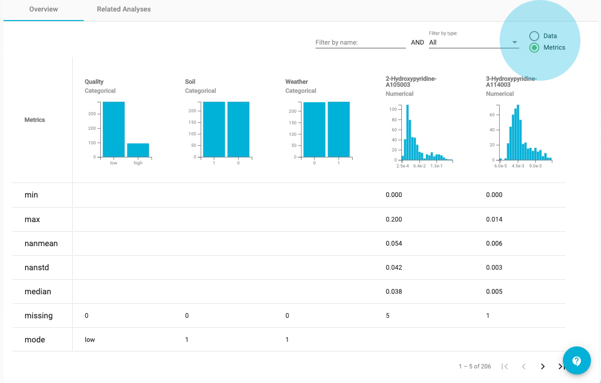
- Overview displays the dataset’s column and row labels for the first five samples and first five features with their assigned data types. Tools to navigate or Filter, by name or by type, are embedded in the preview.
- Related Analyses displays the previous run analyses of the dataset, when the data have been analyzed previously, as in this Project.
- Select the Metrics radio button to view graphical and numerical summaries of each feature in the dataset (i.e. histograms).
In the Metrics view:
For the quality feature, one can see that of the 478 samples, 384 are in the low-quality group and 94 are in the high quality group.
Under Actions, JADBio gives you the option to Perform Analysis with this dataset. We will perform an analysis with this data later in the tutorial, but in a new Project.
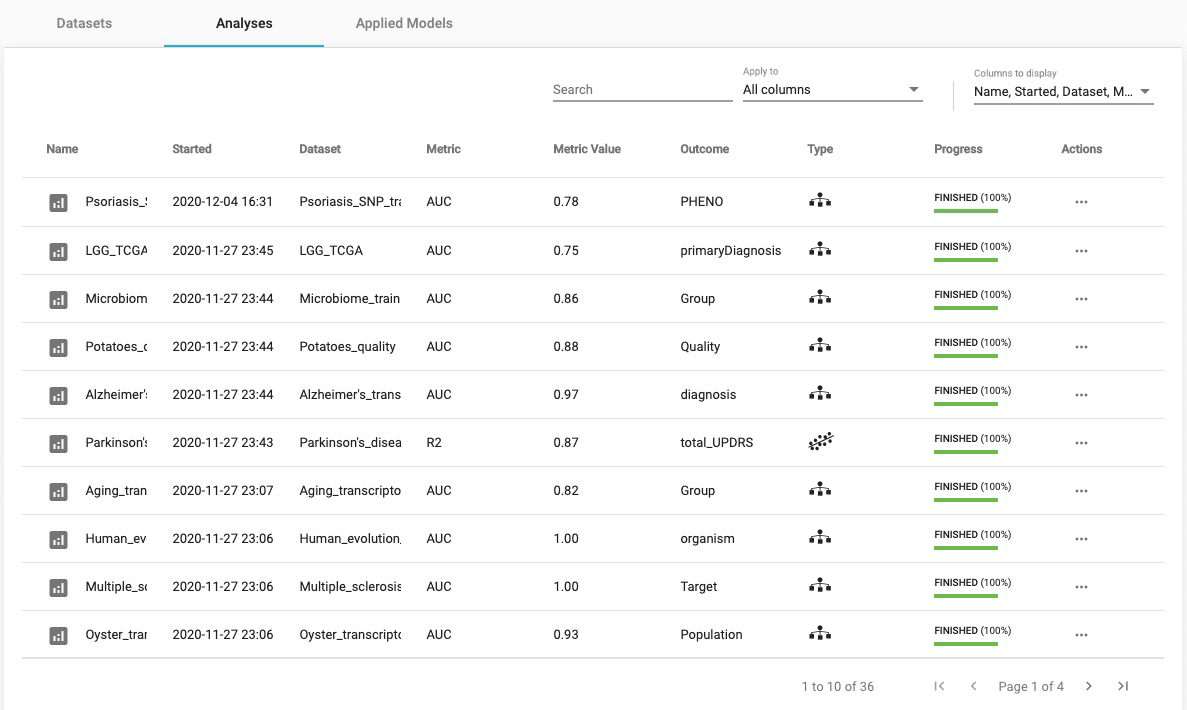
ANALYSES
Click on the Analyses label, to view the previously run analyses in the JADBio Use Cases project.
Within the Analyses page, JADBio describes all analyses, including those currently running. Furthermore, the analysis type is described by an icon. Here, we have Regression, Classification, and Survival (Time to Event) analyses.
Analyses also includes a description in tabular format:
- Name
- Started (date)
- Dataset
- Metric
- Metric Value
- Outcome
- Type
- Progress
- Actions, includes: View results, Apply model and Remove results buttons
CREATING A PROJECT
All of the datasets and analyses within the JAD Use Cases project are read only. In order to start working with data, you must create a new project. You can create a new project and upload data from the JAD Use Cases project.
On the MENU sidebar at the left of the JADBio window, click on Projects.
This will bring you to the Projects window, which includes the Create a new Project function.
Click on the CREATE button.
Name your Project adding a Description, if you wish to. These can be altered at any time.
Click on the CREATE button.
Your new project will now appear in the Projects window.

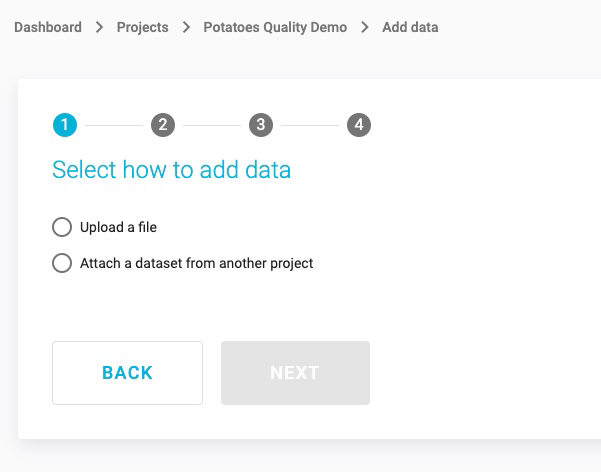
SAMPLE DATASET: POTATOES QUALITY
To get you started use the existing Potatoes_quality dataset from the JAD Use cases project.
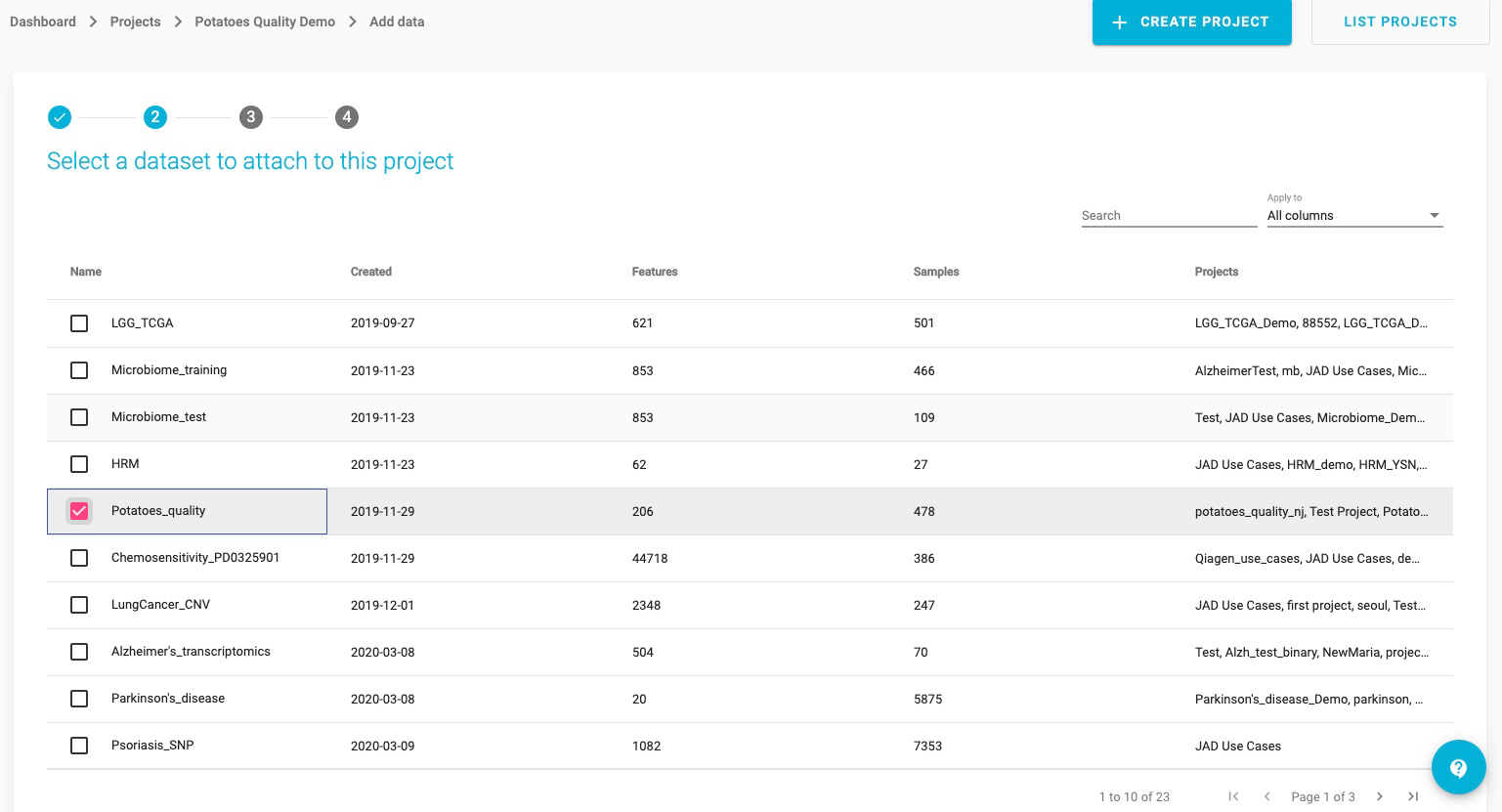
Click on the radio button, Attach a dataset from another project.
JADBio will now present you with a list of datasets in a tabular format.
Select the Potatoes_quality dataset (Note: You may have to search for it or scroll down to see it).
Click the NEXT button.
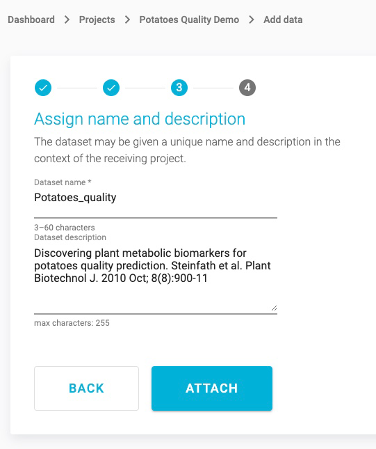
This opens the Assign name and a description window. Here, you are able to change your Dataset’s name and add a description for your dataset.
Click the ATTACH button, to connect this dataset with your project.
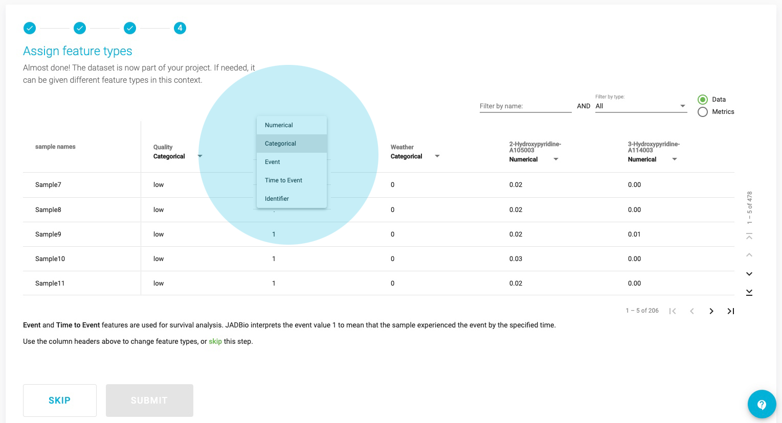
This opens the Assign feature types window. JADBio automatically assigns feature types based on the content of each column, but you can change the feature types here or in a transformation step to suit you understanding of your data. Here, you can change the type of features i.e. to assign an event or a time-to-event feature type. Also, as in the Preview dataset window, you are able to navigate across the dataset, search and filter the dataset, and view the metrics of each feature in the Metrics view.
Note: Feature types are critical to the process of using the JADBio platform. If you are not familiar with feature types, please reach out to technical support for additional information.
Click SKIP to move the data, without changing any feature type, into your project.
SAMPLE DATASET: POTATOES QUALITY
You are now in the Datasets window of the Potatoes_quality_demo Project. You can see that your new dataset has 206 Features and 478 Samples.

Under the Actions header on the three dots, you have three options: Preview Dataset, Perform Analysis and Detach Dataset from project.
Data Transformation takes place in two steps:
1. Select transformation type and
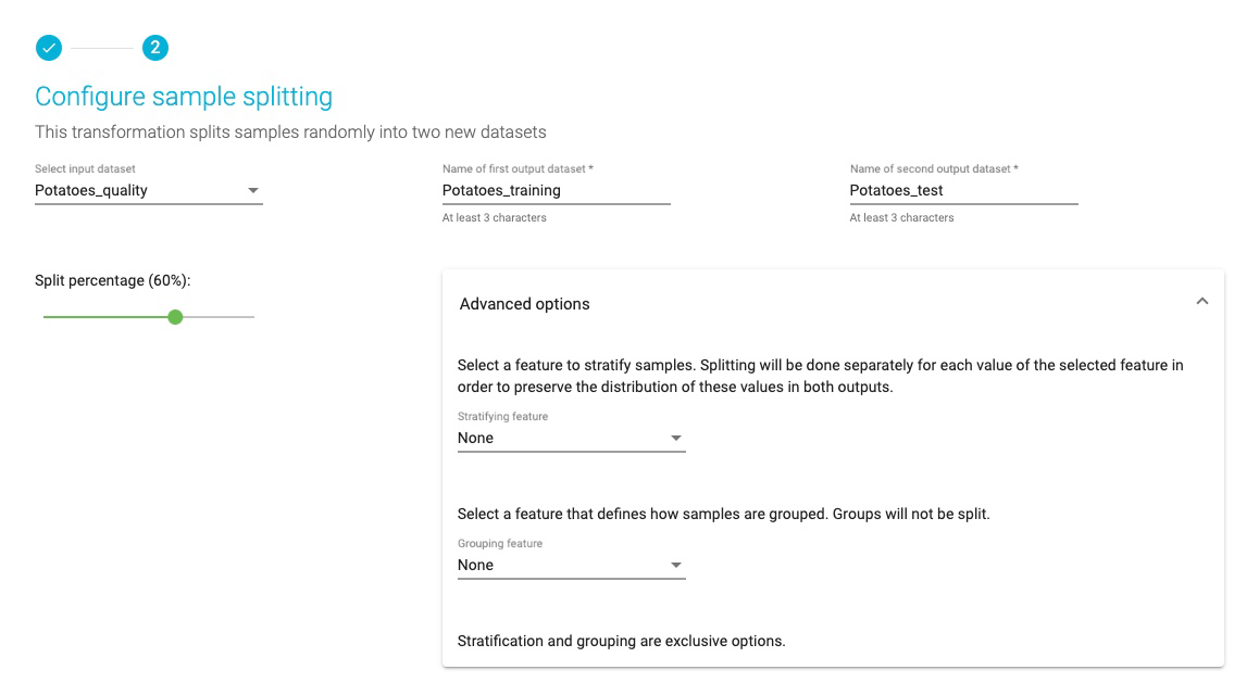
2. Transformation configuration, and JADBio currently provides four different transformation types: Filter, Merge, Split and Change dataset. You are going to create two datasets, test and training, from the imported dataset, so you will use the Split function.
Select the Split option – Note: Split samples randomly into two datasets.
Click NEXT.
This opens the wizard, Configure sample splitting.

SAMPLE DATASET: POTATOES QUALITY
- From the Select input dataset pulldown, select the Potatoes_quality dataset.
- Name the first output dataset Potatoes_training and name the second, Potatoes_test.
- Set split percentage at 60%.

Note: Advanced options will allow you to select a feature for stratified splitting and/or a feature that defines how samples are grouped. This is not necessary for this demonstration.
Click on the TRANSFORM button.
SAMPLE DATASET: POTATOES QUALITY
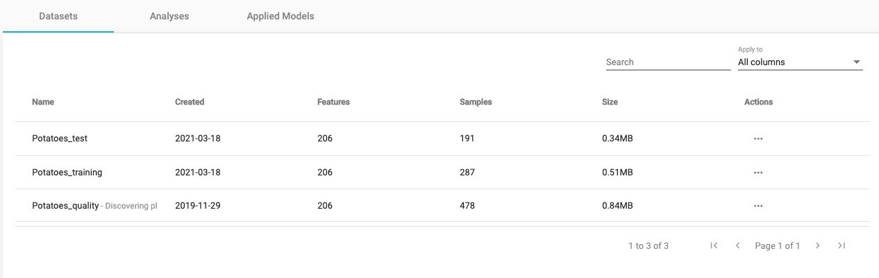
You will now have three datasets in your Potatoes_quality_demo project.
Note the sample split in the two new datasets.
BACKGROUND
Up to now, the prediction of complex phenotypes in plants like potatoes was based on growing plants and assaying the organs of interest in a time intensive process. Conventional genetic biomarkers are commonly applied in quality assessment and progeny selection but their application is still problematic for complex traits such as yield, disease resistances or stress tolerance.
A simple and accurate predictive test for potatoes yield quality could be derived from the analysis of potato metabolic biomarkers. In this demonstration, you will create, train and test a model based on the data from on 20 different potato cultivars grown in two Northern German potato farms, as described in the Steinfath et al. publication referenced below. These data include 203 metabolites measured on the tubers, Soil (loamy versus sandy) and climate (coastal versus inland) information and two traits ‘susceptibility to black spot bruising’ and ‘chip quality”. You will see that with JADBio you will produce accurate predictive models that are on par with the ones presented in the original publication, regardless of your expertise in advanced machine learning techniques.
Original publication: Steinfath et al, Plant Biotech Journal 2010
SAMPLE DATASET: POTATOES QUALITY
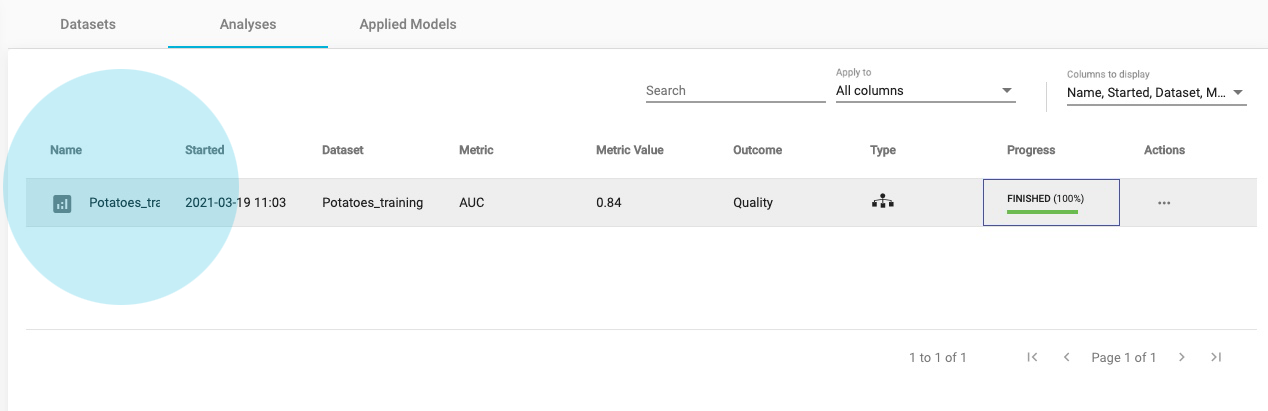
From the table of Datasets, in the Potatoes_training dataset click on Perform Analysis.
In Select outcome check the feature box Quality. Press Next.


Note: Because you have chosen an outcome in which the values are distributed into two classes, a categorical feature, JADBio will create a model based on a binary classification analysis.
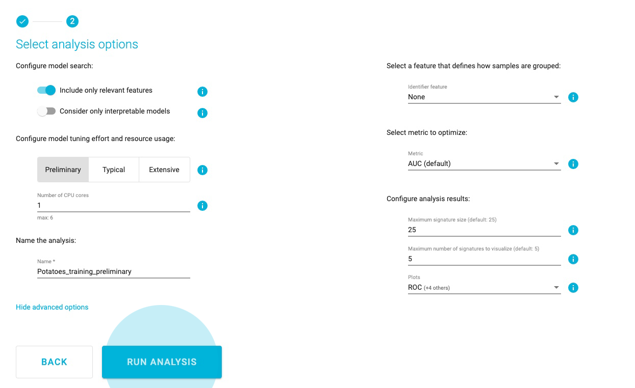
SAMPLE DATASET: POTATOES QUALITY
Select analysis options
Set the Predictive analysis options as follows:
Include only relevant features
Consider only interpretable models
Tuning effort: Preliminary, for a quick first assessment
Number of CPU cores: 1
JADBio will automatically create a descriptive name for your analysis based on your selections, which you can change.
Name the Analysis: Potatoes_training_preliminary
While there are many other options, the default values for the advanced settings are the following:
There is no requirement for an Identifier feature, to group the samples of the dataset.
The analysis will optimize performance based on the AUC (area under the ROC curve).
Maximum signature size is 25 features.
Maximum multiple signatures to visualize is 5.
JADBio will create four plots, PCA, UMAP, ICE, and Probabilities.

Click RUN ANALYSIS to start the analysis.
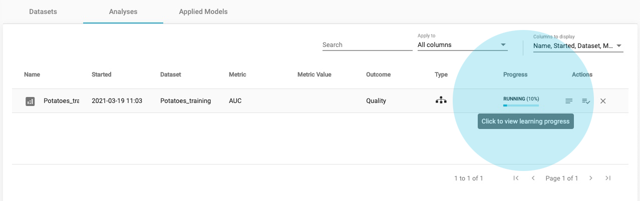
As soon as you begin the analysis, JADBio reports Progress in the Analyses table.
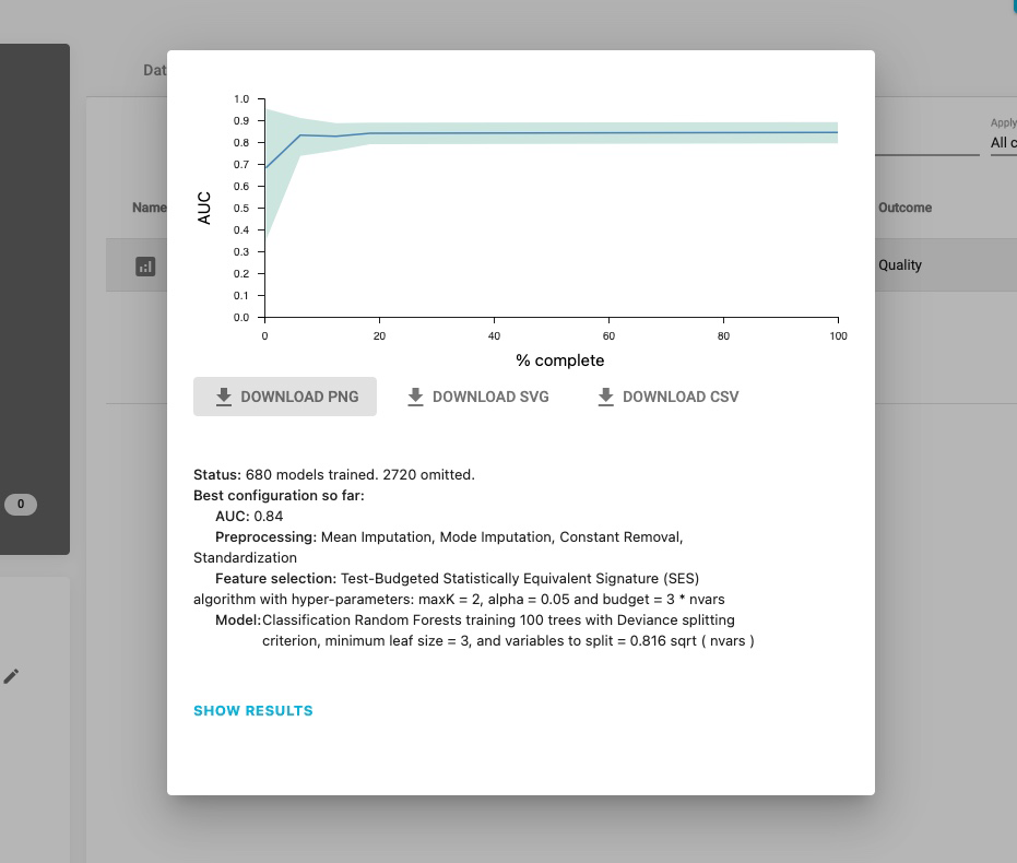
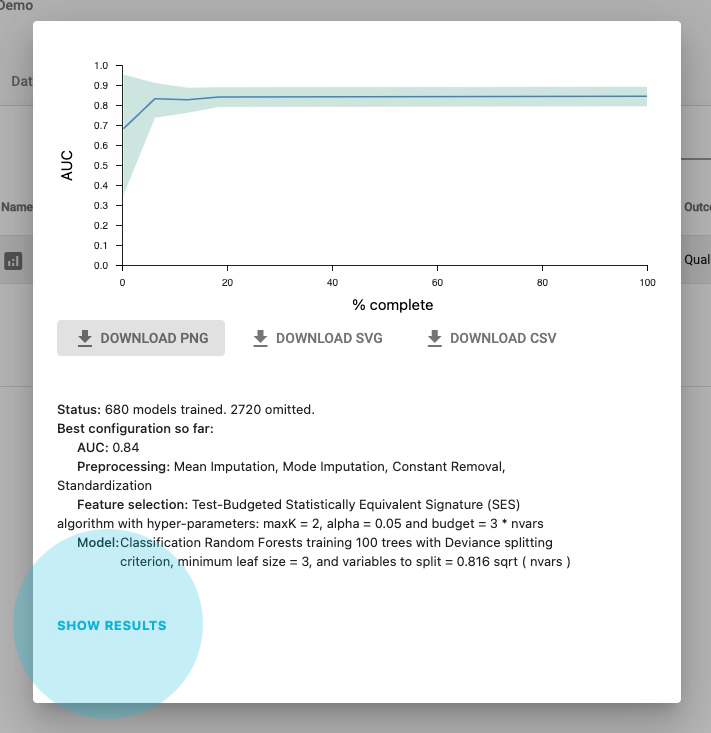
Click on the blue progress bar to view learning progress, you can watch each step in the analysis progression.
Click on the main window to return to close the Analyses window.
You do not have to wait for the learning progress to finish in order to move away from the window in your browser. You can also monitor when it will finish through your Dashboard.
Finally, you can view the results by selecting Show Results in the pop-up Learning Progress window, if it’s completed or by selecting the final analysis.
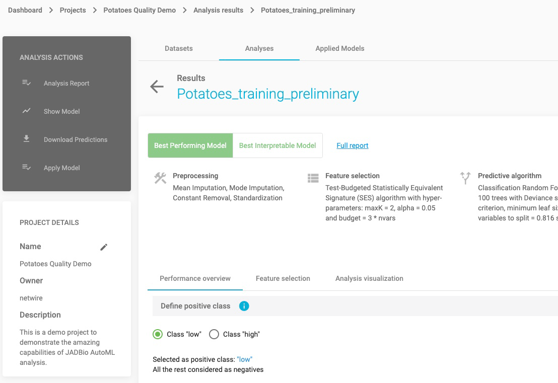
ANALYSIS RESULTS
Select the finalized analysis (under the Analyses tab)
In the new window you will find a sidebar menu, on the left, for ANALYSIS ACTIONS. This provides options to:
- Summarize the analysis (as an Analysis Report),
- Show Model (if it is an interpretable one)
- Download Predictions of the samples
- Apply Model to new samples
Click on Analysis Report
Here, JADBio provides a summary audit of the analysis including: Dataset, Outcome to Predict, Analysis Type, etc. and a description of the selected options as well as the JADBio version.
JADBio also presents a list of all of the configurations that were tested in order to produce the model and selected features. The list is not long in this example, but more complex analyses may test up to 1000s of configurations. Specifically, for this analysis 5 configurations were tested which you can download by clicking on the DOWNLOAD CSV button.
Click on return button to return to the main analysis results page.

Note: In the top right corner, there is icon you can use to share your results with anyone over the web, regardless if they are users of JADBio.
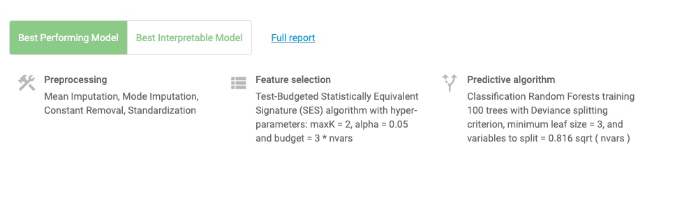
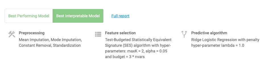
Note: Depending on what you selected in the analysis parameters, you can force JADBio to only report an interpretable models as the Best Performing Model. Otherwise, JADBio is able to provide two models, Best Performing Model and Best Interpretable Model.
Click on the Show Model in the ANALYSIS ACTIONS sidebar.
JADBio displays four, out of the total 206 features, that provide the most accurate prediction of potatoes quality. The features include Fructose-A187002, Lysine-A192003 and Soil:0 whose expression are in a negative relationship to the prediction and 2-Hydroxypyridine-A105003 whose expression is in a positive relationship to the prediction.
Hover over the features bar to visualize the values for the optimized Ridge Logistic Regression model.
The numbers provided describe the relative strength of the predictors based on the logistic model. The larger the absolute value of the feature’s value in the model, the greater the impact that feature is in the analysis of any one sample’s outcome. In this potatoes’ quality example, Fructose-A187002, is a stronger level of evidence for the quality prediction in any sample than the other features.

Note: It is possible to download both the image and the numbers supporting the image from the PNG, SVG, CSV buttons.
SAMPLE DATASET: POTATOES QUALITY
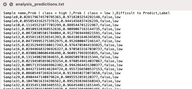
Click on the Download Predictions.
In the downloaded analysis_predictions.txt, you will see each of the analyzed samples and, based on the cross validation of the best configuration, their relative difficulty of predictions. For each sample you will see the probability the sample would be predicted low or high quality. In this dataset, 268 of 287 samples are labeled as FALSE (not difficult to predict). The Label column is the actual values from the dataset.

SAMPLE DATASET: POTATOES QUALITY
Define positive class
Reference class is considered the class of Positive samples and the rest are considered Negative ones. For this example, let’s consider ‘high” as the positive class.
Threshold independent metrics
The performance of the binary classifier (low or high quality) can be described by the Area Under the Curve (AUC) of the ROC curve and by Average Precision of the Precision-Recall curve.
A Receiver Operating Characteristic curve (or ROC curve) summarizes the trade-off between the true positive rate (sensitivity) (y-axis) and the false positive rate (1-specificity) (x-axis) for different probability thresholds. The best ROC curves are the ones where X (false positive rate) = 0 and Y (true positive rate) = 1.
A precision-recall curve (or PR Curve) is a plot of the precision (y-axis) and the recall (x-axis) for different probability thresholds. The best PR curves are the ones where X (recall) = 1 and Y (precision) = 1.
Note: In the SHOW ADVANCED OPTIONS button, JADBio allows you to choose between three values of significance levels.
SAMPLE DATASET: POTATOES QUALITY
JADBio allows you to optimize the classification threshold for a gradient of metrics for optimal specificity to optimal sensitivity.
Optimize classification threshold as: 0.82147636, and note the selection of the position on the ROC curve.
Hover over the highlighted ROC curve to see the full range of metrics at this threshold.
Click on the ROC plot | Prediction recall plot button to view the Precision recall plot.
Note: ROC curves are appropriate when the observations are balanced between each class, whereas precision-recall curves are appropriate for imbalanced datasets.
SAMPLE DATASET: POTATOES QUALITY
Confusion Matrix
Confusion matrix is a table that describes the performance of a classification model (or “classifier”) on predicted class (values) for which the true class (values) is known. In JADBio, confusion matrix displays either the percentages or a heatmap of the predicted values vs the real true values.
Threshold dependent metrics
Here, JADBio reports 13 different metrics and their confidence intervals based on your Best Performing Model.
Hover over any “i” adjacent to a metric for an explanation of the score.
How you set the thresholds will be determine the overall sensitivity and specificity of the model.
Note: As you move your cursor in the JADBio windows, JADBio will provide contextual information or links to relevant locations within the application.
SAMPLE DATASET: POTATOES QUALITY
Selected Signatures
A signature is a minimal subset of predictive features that, when considered jointly, are maximally informative for an outcome of interest. As a product of each analysis, JADBio produces all signatures that perform equally well, up to the maximum limit defined in parameters. In this example, JADBio produced 4 equivalent signatures.
The Individual Conditional Expectation (ICE) plots further reveal the nature of the contribution of each metabolite feature to the model.
Click on the thumbprint ICE plot adjacent to Fructose-A187002 feature to enlarge the ICE plot.
This opens the ICE plot for the prediction of “high” quality classification. In this plot, you can see that as the metabolite level increases, the likelihood of a “high” quality classification decreases.
Use the pulldown to select the Class low.
As one would expect for a binary classification, the level of Fructose-A187002 metabolite has the inverse correlation to a low-quality classification.
Feature Importance plots
The practical use of Feature Importance plots is evident in the case of selecting biomarkers. For instance, the purpose of this analysis is to identify the optimal list of biomarkers that predict potato quality. However, in order to satisfy economical or technical constraints on an assay, JADBio also reports the cost to performance that occurs when one chooses to further reduce the total number of predictive biomarkers from those included in the Best Performing Model. In this way, you, can evaluate the trade-off between reducing the number of biomarkers and achieving optimal performance.
Both in the Progressive Feature Inclusion and in the Feature Importance view, JADBio displays the four features of the selected signature and their relative performance.
ANALYSIS VISUALIZATION
Select the Analysis Visualization tab.
Uniform Manifold Approximation and Projection for Dimension Reduction (UMAP) is a dimension reduction technique that attempts to learn the high-dimensional manifold on which the original data lays, and then maps it down to two dimensions. UMAP is ideal for non-linear models.
Change the Display as selection from UMAP to PCA.
Principal component analysis (PCA) is another dimensionality reduction technique that seeks the linear combinations (Principal Components) of the original features such that the derived features capture maximal variance.
The appropriate visualizations for this model are UMAP and PCA plot, in which the low and high quality predictions are visualized. Other types of analysis and other types of models would likely result in different visualizations. For instance, a survival (time to event) analysis would have resulted in a Kaplan-Meier curve.
Scroll down to see the Probabilities plot.
The Probabilities plot shows, for both classes, the probability of the prediction resulting in the high class. An ideal plot would have complete separation between the two classes. You can also visualize the probabilities in a box plot.
SAMPLE DATASET: POTATOES QUALITY
Scroll to the top of the page, and click on the Potatoes_quality_demo project label.
In the ACTIONS sidebar, click on Apply Model.
In Select outcome check the feature box Quality.
There are four steps to the validation process:
Select Analysis
Check the only analysis option available in the Project, Potatoes_training_preliminary, which you just created and reviewed.
Click NEXT.
2. Select model and signature
- Select model: There is only model available, which is already selected.
- Select signature: Place a check in the second row of the four statistically equivalent signatures.
Click NEXT.
3. Select how to apply the model
Select the option, Validate model against labeled samples.
Click NEXT
This selection allows JADBio to use the test dataset you created, when you split the original dataset into training and test datasets. If you choose to Predict outcomes for Unlabelled samples, JADBio will give you the option to upload another dataset. The only requirement you will have for this dataset is that it includes the Predictors in the selected signature with the same names as in the training data. If you select to Predict outcomes for manually entered predictor values, JADBio will provide a dialog for manually entering values for each of the Predictors in the Signature to generate a prediction. If you choose to Download model to make predictions off-line will give you the options to download a standalone version of the chosen model that can be applied on new data on a local machine.
4. Select labeled dataset
Select the dataset: Potatoes_test
Click APPLY MODEL
JADBio will automatically bring you to the Applied Models window, where you can view the results of your Applied Model on the test data set.
Click on the Actions function, View results to open the results window.
The results window is similar to the original training dataset window, but with some exceptions. In the VALIDATION ACTIONS sidebar, there are buttons to Download Predictions of the samples and Apply Model to new samples.
SAMPLE DATASET: POTATOES QUALITY
In the main Applied Model window, JADBio displays the four features from the selected signature.
Define Class High as the positive class, using the radio buttons on the top.
Now, JADBio displays the AUC and the Average Precision of the validation and the train datasets
The new ROC and Precision recall curves include the results from the original Train — data and from the test data, Validation —.
JADBio also displays the confusion matrix for the Validation and the Model (training) datasets and the 13 threshold dependent metrics.
Click on the Analysis Visualization tab.
Here, the Supervised Principal Component Analysis displays the segregation of the low and high class test data based on the model from the training data.
Note of appreciation to JADBio users: We constantly make changes in the software and do our best to update these materials, but you may notice some differences. We welcome your feedback on how to make this more useful for you and requests for future tutorials.